Let’s judge some books by their covers.

Let’s do an unscientific, biased, uneducated study, shall we?
I’m taking part in an Instafreebie Group Giveaway (get yours free until March 15, 2018) and it’s interesting to see what’s “working” and what’s not.
No big data, no experience necessary, I’m just going to take a look at which covers have been claimed more than others and maybe try to do a quick analysis of why. Here goes.
Quick numbers of claims:
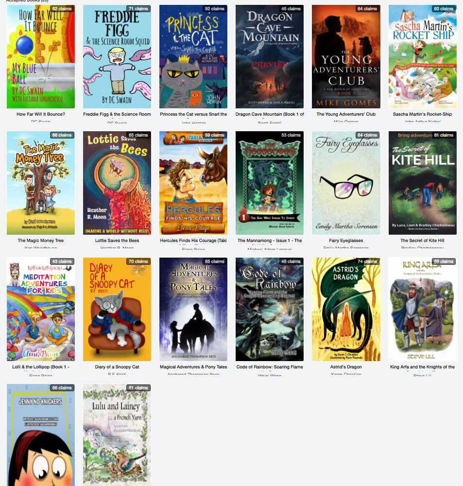
- 92 (high): Princess the Cat versus Snarl the Coyote
- 81: The Secret of Kite Hill (yes, my book)
- 64: The Young Adventurers’ Club (I like this one)
- 51: Lulu and Lainey (don’t like this one much)
- 43 (low): Lolli & the Lollipop (Book 1 – Meditation Adventures for Kids series)
My take:
Princess the Cat versus Snarl the Coyote
The cat looks kinda mean, but in a fun, “cat” way! Love the descriptors of the animals (princess and snarl). The cover looks custom drawn for the book. If you look closely, there are four characters (animals) on the cover. There’s a lot going on with the cover, but somehow it’s not too busy. The title is in a cool, easy-to-read font.
The Secret of Kite Hill
I happen to know that the cover was a custom job and, although I think it’s too dark, I appreciate the mystery of what they’re looking into the cave for. I like the dog. The title is easy to read.
The Young Adventurers’ Club
Very professional cover, but looks to be targeted at a higher age group. Of course, this Group Giveaway is billed as several age groups, so that’s fine. Maybe I resonate with it because I see it more for my own boys (12 and 14). I love the covers and simplicity of it.
Lulu and Lainey
Probably just personal preference, but it’s too water colored and there’s a bird and … I don’t know why I should read it. “A French Yarn”? So, is it just a tale about a bird in France? Sorry, not to be harsh, but trying to just be objective and analyze covers here. How could it be better? Stronger (larger) title, something in subtitle that was more inviting/intriguing.
Lolli & the Lollipop (Book 1 – Meditation Adventures for Kids series)
This is a really good example to analyze because I LOVE the title and topic (meditation adventures for kids–awesome!), but the overuse of rainbow colors and the (please tell me that’s not Comic Sans) font is just too much. I’m truly curious about this one as is it the cover design or the title that has it coming in last here? Or both? I would love to introduce this book to my kids but they already think I’m a wacko for meditating, so how can I make it more appealing? Maybe the cover could have more about what happens to you when you meditate: increased creativity, improved _________, etc. I see a little of that with the mushrooms (hopefully that’s not a psychedelic drug reference!) and house, but I’d want to see more, I don’t know, “fantasy.”
Again, please realize that these are just my personal opinions, but I’m trying to be objective and see why some titles were downloaded more than others.
The giveaway is still active for a few more days. Go grab your favorites at Instafreebie.

