


What makes a strong logo?
It doesn’t need much. But it needs that … something.
That “something” is intended to suggest the “somethin’ somethin'” that is, of course, impossible to translate. It’s not the “something” like “anything” or “I don’t know what the word is.” Glad I got that out of the way.
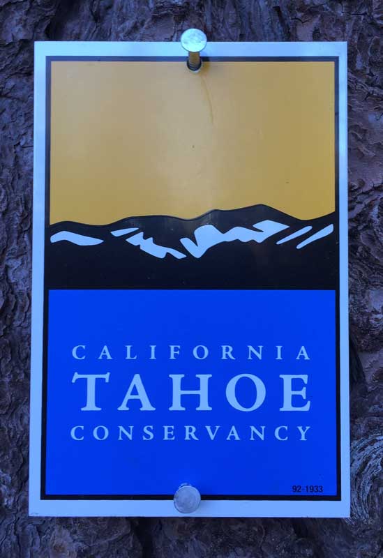
3 colors, minimal graphics = impact. [South Lake Tahoe tree]
Are they subject or objective?
Is there a checklist? Can you say one is good or bad? (Well, yes.) Or is more just an opinion? OK, to be fair, here are some good ones, too.
What does a logo need to do?
- Suggest a message
- Be memorable
- Convey the personality of the company
What would be nice for a logo?
- Unique (does it look almost like something else?)
- Adaptable (can you easily put it on a coffee cup?)
- Timeless (will it be out of fashion next year?)
- Appropriate (who is the audience?)
Take the California Tahoe Conservancy on the page. It’s bold, simple, but also beautiful. Of course, all I can really read is “Tahoe” so it might be from the tourist board and then I’m not exactly sure what a “conservancy” is either, but that’s OK, I like the yellows and blues.
So it is a failure? Because I:
- Don’t know who the company is
- Don’t know what the company does
But hey, looks pretty!
How suggestive is the world of the logo? Do all factors that come into play with all things subjective again come into play? Influence of others, color science and psychology, studies on forms and shapes and what they do to our minds.
Or what if we just like the thing? Yeah, that works.
What are the pros saying about great logos?
- Characteristics of Great Logo Design by Lauren Cannon on Inc.com
- 65 expert logo design tips from Creative Bloq
- Vital Tips For Effective Logo Design by Jacob Cass on Smashing Magazine
- 5 tips for successful business logo design by Cecily Kellogg on 99Designs


Trackbacks/Pingbacks